
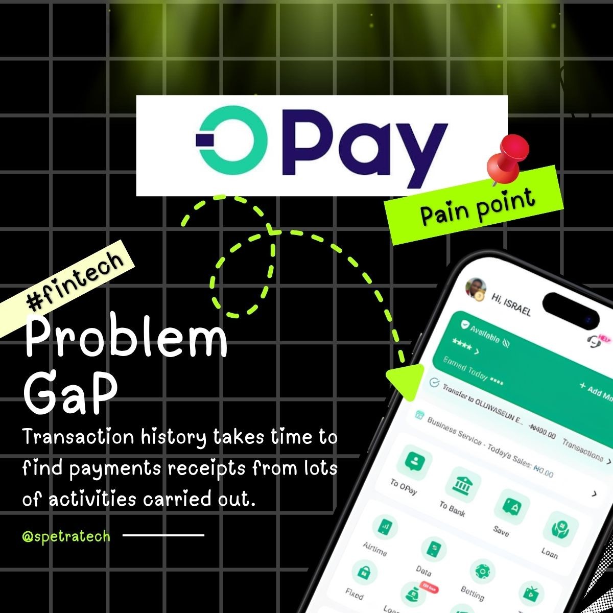
2 days ago, I was on a call with a friend when something came up that made me realize a gap many fintech apps still have yet to solve.
And here’s what she said:
“Please, do you still have this payment receipt?”
I mean, this wasn’t a 2-month-old or even a 6-month-old receipt. I’m a big fan of OPay for my daily transactions. Even when I’m boarding a bike for ₦500, I’ll still make a transfer. 😂
To me UBA is the money vault, #Opay is the distributor who sends funds across my #Moniepoint, to my #Grey app and #Cleva banking app.
So, the good me was like, “Hmm, okay, let me check my OPay app.” 5 minutes later, I was still scrolling through my transaction history. 15 minutes later, after scrolling back and forth in frustration, I finally found it.
Then I thought, “What the heck just happened?”
Can’t I just filter my transactions by a simple query and find exactly what I’m looking for?
But wait, Israel, are you saying the current design isn’t good enough?
Nah, that’s not what I’m saying.
But from a UX perspective, there’s room to make transaction history easier to navigate. The current filters allow users to narrow transactions by category and status, but what if you want to find a specific transaction from months ago without remembering the exact date?
That’s the gap I noticed, and I decided to explore a possible solution. Rather than redesigning the entire interface for all #fintech app, I focused on this one app for solving this pain point.
My proposed solution
A simple search and filter experience that lets users find transactions by:
- Recipient or sender name
- Amount sent or received
- Transaction period (last 3 months, 6 months, or 1 year)
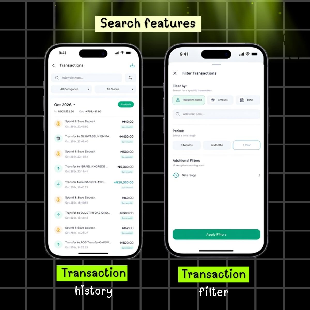
The search would accept both text and numbers, making it easier to find a transaction whether you remember who you paid or how much you sent.
Because sometimes, a better user experience doesn’t require redesigning everything. It starts with identifying one frustrating moment and making it easier.
That’s what I explored with this UI/UX concept.
Now, I’m curious: have you ever struggled to find an old transaction on a fintech app?
And if you were designing this experience, what would you do differently?
Now I hope our fintech apps will be able to serve us more better.
Thank you ❤ OPay, Moniepoint Group, Cleva (YC W24), Grey (YC W22), for serving us better.
Want to work together?
I take on a limited number of projects at a time — happy to talk through what you're building.
Book a call